
Chapter 9: Your own risk matrix
9.1 Why you shouldn’t read this chapter
If you’ve read chapters 7 and 8 and decided to use clear “harm statements” you can ignore this chapter, and go straight to Chapter 11 to get on with controlling risk. However, if you (or your employer) insist on a risk matrix, this chapter shows you how to test what you are using.
You might want to use a matrix to prioritise. For example, you take on a project where almost nothing has been done to assess risks and manage hazards. You have limited resources, so you need to decide what comes first. Will you fill the holes in the pavement first, or cut down the dangerous trees? The right matrix could help you to prioritise – or to justify those priorities. However, as we’ll see in Section 9.4, even then, speed of getting controls in place is often dictated by practicalities, rather than risk scores.
9.2 Devising a matrix
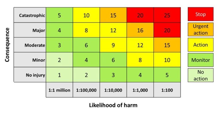
If you have a matrix that you usually use, have it in front of you as you read this chapter. Alternatively, you can use a typical matrix shown in Figure 9.1. If your matrix doesn’t have the lowest likelihood and lowest consequence in the bottom left-hand corner you will have to adjust some questions.
I’m not suggesting you use any of the examples I present. If you need a matrix (or have been told by your organisation that you must have one) use the ideas in this chapter and the next to create, and then test, your own.
Figure 9.1: Typical 5x5 matrix
9.3 Reduce your axes
Ask yourself:
Think of a hazard, and the hazardous event that could result. If your mind goes blank, think about the next journey you are going to take, and about something that could go happen on that journey (a crash, a tree falling on you, a delay, a chance meeting with an ex). Without any scale, how likely is that event? Now rank the likelihood of that event on each of the following likelihood scales (circle one rating in each line).
Figure 9.2: Likelihood labels
| Impossible | Remote | Unlikely | Possible | Unusual | Known | Likely | Usual | Certain |
| Almost impossible | Highly unlikely | Unlikely | Possible | Even chance | Probable | Likely | Certain |
| Rare | Unlikely | Possible | Likely | Almost certain |
| Negligible | Remote | Possible | Probable |
| Low | Medium | High |
If it was easy to select one of the extremes on each occasion, try again with a different hazardous event. Which was the easiest scale to use?
The longer the scale, the less consistently people are likely to respond.. If someone was explaining the likelihood of an accident to you, would you be more concerned if they said it was possible or likely? I haven’t invented these – they are all schemes I’ve seen in use. In one case probable is the top category, and in another there are two further scores above that. What sort of accident is more frequent than “even chance”? I asked a client if this meant someone falling off a ladder every other time one was climbed. Or if half of ladder climbers would fall off a ladder each year. Or was there some other explanation? The truth was, they never looked at the definition, and just “estimated” the rank numbers, using 3 as the “average” score.
In most cases, a 3-point scale for both severity and likelihood is enough, as the rest of this chapter will demonstrate.
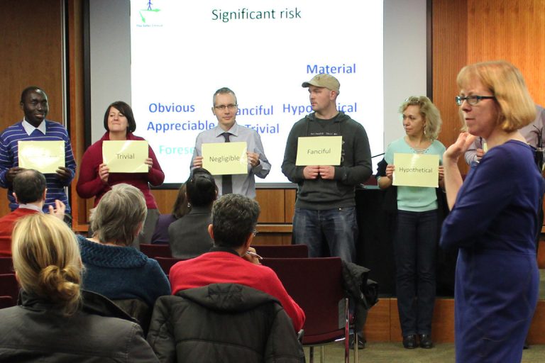
Even health and safety professions can't agree on the same order for qualitative labels (IOSH Metropolitan event, 2014)
9.4 Simplify the outcomes
Ask yourself:
- How many outcomes are there on your risk matrix (or on the HSE one)?
- How many things are you going to do as a result of assessing the risk?
- Are these two numbers the same?
a. The HSE deprecated risk matrix in Figure 7.1 had five outcomes, as does the example in Figure 9.1. How many does yours have?
b. How many things might you do as a result of assessing the risk? I usually consider three options. Read through these and tell me what else you might do:
1) I think the risk is low enough with what we’re currently doing to control the risk. I’ll continue to monitor the hazard and how we control it.
2) Carry on for now, but identify ways to make it safer. Can I make the current controls more effective? Is there something else we can do?
3) Stop. This is too dangerous to carry on doing like this. If we can’t find a way of making it safer, we should stop doing it, now.
c. A 3×3 matrix can give me 5 outcomes. A 5×5 matrix could give you up to 9 outcomes if you needed them (or 14 if you think the numbers are meaningful). If I only have three decisions I can make, a 3×3 matrix sounds plenty big enough.
You could spend hours of discussion to decide which of five likelihood categories to assign, and which of five severity categories to assign, and at the end all that detail is thrown away because we only have three courses of action we can take.
If I only need three outcomes, I can use a 3×3 grid like Figure 9.3.
Figure 9.3 Simplified risk matrix
| High | Manage | Manage | Stop now | |
| Potential severity of harm | Medium | Monitor | Manage | Manage |
| Low | Monitor | Monitor | Manage | |
| Low | Medium | High | ||
| Likelihood of harm occuring | ||||
Notice two things about this Figure 9.3 (and the others in this chapter).
First, no numbers. As soon as you start assigning numbers to the labels and multiplying them, some people will think they have a quantitative risk assessment. You could number the categories 1, 2, 3 or 1, 10, 100. You could multiply them or add them together. It won’t make any difference. What we’re trying to do is prioritise spending on reducing harm. You can see how that works in the matrix without numbers.
Second, no decoding. Instead of requiring separate tables to assign and then interpret a label iike ‘moderate’, you only need one table to go directly from your assessment of likelihood and severity to the risk management step.
Where I have changed the colouring from green to amber, and amber to red depends on my risk appetite. I could have taken a more risk-averse approach and decided that only low-low should be green, and that where a high severity outcome is possible, I’m going to stop the activity unless I am sure the likelihood is low. Figure 9.4 shows this more risk-averse version.
Figure 9.4 Risk averse matrix
| High severity | Manage | Stop now | Stop now |
| Medium severity | Manage | Manage | Manage |
| Low severity | Monitor | Manage | Manage |
| Low | Medium | High | |
| Likelihood of harm occuring | |||
Notice that the matrix in Figure 9.4 is not symmetrical – I’ve decided to treat a medium risk of a high severity outcome with more urgency that a high likelihood of a medium severity outcome. If that shocks you, stop and think about why you believe it should be symmetrical. Is it because you are used to putting numbers in those cells – so 3×2 = 6 and so does 2×3, and therefore the ‘risk’ is the same for medium/high as for high/medium. But as explained in Chapter 7 (7.1.4) those numbers were ordinal numbers, not ratio, so you never should have assumed that the product of those numbers had any meaning. We’ll return to this when we consider how to check the boundaries in Chapter 10.
Ask yourself:
Given three colours, how else might you colour these blocks? Figure 9.5 has one without colours for you to play with. Compare your alternative with some of the options in this chapter, and in Chapter 10.
Figure 9.5: A blank risk matrix for you to colour in
| High severity | |||
| Medium severity | |||
| Low severity | |||
| Low | Medium | High | |
| Likelihood of harm occuring | |||
9.5 'But I need more than 3 outcomes'
Perhaps in your organisation there are more decisions. Before you decide how many categories of likelihood and severity you need, write down all the decisions you might make. Perhaps you have some budget left for this year, and some that won’t be available until next year. You might decide on 4 outcomes:
1) Low enough risk to leave and monitor.
2) Identify practical ways to make it safer in next year’s budget.
3) Identify practical ways to make it safer with this year’s budget.
4) Stop now.
Even if you came up with 5 options (perhaps you have a longer planning cycle, and want to prioritise spending for 2 years) a 3×3 grid is big enough.
Figure 9.6 shows how you can assign five outcomes on a 3×3 grid.
Figure 9.6: 3x3 risk matrix with five outcomes
| High severity | Next year’s budget | This year’s budget | Stop now |
| Medium severity | Within two years | Next year’s budget | This year’s budget |
| Low severity | Monitor | Within two years | Next year’s budget |
| Low | Medium | High | |
| Likelihood of harm occuring | |||
Some organisations apply different timescales for fixes, depending on the matrix score. So they might argue they need more categories. But in reality, most timescales are determined by practicality, not by any phoney maths. Can you really insist that the fire door is replaced within 24 hours but give someone six weeks to move some boxes, because that’s where the hazards fall in your complex grid. You can move the boxes from in front of the fire door today, you can arrange for the shelf to be lowered by maintenance in the next few days, but it will take several months to raise the budget and arrange the contract for a non-slip floor surface. You might need to take some temporary actions in the short term – extra cleaning while you wait for a new floor, and temporary storage while you wait for the new shelf. But a risk matrix that assigns specific timescales based on narrow risk decisions could tie you up in knots.
9.6 Understand your axes - likelihood
Ask yourself:
What do your different likelihood categories mean? Are they mutually exclusive?
Given some frequency data such as “this might happen once in ten years” would different people in your organisation agree on how to score the likelihood of harm?
When I was studying for my Masters, a tutor asked a class to assign probability numbers to some terms, such as rare, infrequent, likely, unlikely, improbable. The scenario was that you had to explain to a pregnant mother that there was a chance her baby would have a particular genetic condition.
Ask yourself:
If parents were told that it was “unlikely” that their child would have a given genetic condition, what probability would you associate with that?
I predict that you came up with a number for unlikely within the range of answers in that classroom. The reason I can make this prediction is that the range of values suggested was from 10% to 0.0001%. Given the scenario, I was astonished that a Masters student could think that if 1 in 10 babies suffered from a condition, you could tell a parent that the condition was “unlikely.” There wasn’t even any agreement in the class as to what order the terms should be – is “improbable” more or less likely than “rare”? I ran an experiment with health and safety professionals where they had to agree on a risk order for similar terms. They didn’t agree either.
Adding numbers as some organisations do, is not the solution.
Ask yourself:
Think of (at least) two problems with applying this scheme for likelihood:
- Very unlikely – 1 in a million
- Unlikely – 1 in 10,000
- Likely – 1 in 100
The first problem is, 1 in a million what?
If it’s years, then even 1 in 100 years sounds quite rare?
If I said it was worker hours, and you had 1000 workers, does 1 in a million still sound ‘unlikely’? If you do the maths, that’s now around twice a year. Suddenly one in a million isn’t so rare.
Let’s assume instead it’s operational hours and that the data is available to be able to estimate that a particular hazardous event occurs about once in 100,000 operational hours. Is that closer to unlikely or to likely? Adding more categories is not the solution.
Unless we base a judgement on statistical data (which happens in fully quantitative risk assessments) we are usually basing it on our own experience. One ‘least bad’ approach is to use data on how often this accident has happened in your organisation (or across your industry). We might have:
- Very unlikely = Once in 20 years, or less often in our organisation.
- Unlikely = Less than once a year, but more than once in 20 years in our organisation.
- Likely = Once a year, or more often in our organisation.
However, I’ve never seen sufficient data to determine the statistical likelihood of the types of incidents considered in occupational health and safety (like a trip or a fall). If you could gather historical data, how would you apply this to changed circumstances or new hazards such as those that could arise from the use of AI?
9.7 Understand your axes - severity
Ask yourself:
What do the consequence categories mean? Are they mutually exclusive?
Given the description of an outcome such as “a broken leg” or “noise-induced hearing loss” would different people in your organisation agree on how to score the severity of harm?
Schemes for consequence, where they are defined, tend to be better than those for likelihood. In the UK, RIDDOR categories are often adopted but these schemes are designed to categorise outcomes after an accident, rather than to predict likely outcomes before the accident. And even experienced risk assessors will argue as to whether the assessment should be predicting the worst-case outcome or the most-likely outcome. Re-read the vehicle accident example in in Chapter 7 and the window example in Chapter 8 if that’s not already clear.
The only matrix on the HSE website in 2024 is not intended for businesses to assess risks, but for HSE Inspectors to use as part of their internal processes.
The harm categories include examples of health effects as well as injuries:
- Serious: Serious personal injury (fatal or major) or serious health effect (permanent, progressive or irreversible condition, or permanently disabling).
- Significant: Significant injury (RIDDOR reportable) or significant health effect (non-permanent, reversible or non-progressive condition, or temporary disability)
- Minor: Minor injury (non-RIDDOR, first aid only) or minor health effect (conditions not included above).
The HSE subdivides each injury type into multiple casualties or ‘single or low’. As a result, the HSE presents six categories of severity which remind us to consider health impacts as well as physical safety. Consider these, but they might not be the right categories for your organisation.
Your categories need to be able to scale to your organisation – is a single death the worst thing you could imagine happening, or is your organisation capable of killing dozens, or hundreds of people in one go? And what is your risk tolerance – is a cut or a bruise a routine injury, that while seeking to avoid, is part of working life? Or would it be regarded as significant? Think of the difference between how a children’s nursery might rank injuries compared to a forestry operation.
We’ll look at an example to identify other mistakes to avoid.
Ask yourself:
What’s wrong with this scheme? Find at least two problems.
- Insignificant – no injury
- Minor – minor injuries needing first aid
- Moderate – up to three days’ absence
- Major – more than seven days’ absence
- Catastrophic – death.
Problem one. Why do we have an insignificant category? I’m not interested in no injury, however high the probability. If you have an insignificant category, consider how and when you will use it. Only keep it if you can justify it.
Problem two. Absence from work is not a reliable measure of severity. Different people might take different durations to recover. If staff can carry on working at a desk job with a broken arm or broken ribs, and take no time off work, would I really classify that as minor? There are historical reasons why some UK-based organisations record 3-day and 7-day absences, but they are not useful categories for estimating severity.
Problem three. Where would you put an issue you expected to result in 5 days from work?
Box: Success story
Recently, I used some of the content from this book to help one of my clients review their own risk matrix. They had inherited a 5×5 grid, and didn’t question it until we used it for some risk assessment training. As a result of the training, the managers decided to change to a 3×3 grid, with simple descriptions of low, medium and high for likelihood and negligible, minor and major for severity of injury. I’m looking forward to seeing the updated risk assessments, and will build any lessons learned back into the book.
9.8 Understand your axes - an alternative
The HSE inspectors’ matrix mentioned earlier had six categories of severity and four categories of likelihood. There is no reason to increase the number of likelihood categories just because you decide to consider additional categories of severity
Figure 9.7 illustrates an asymmetric grid (4×3), with more tightly defined definitions of severity and likelihood.
Figure 9.7: 4x3 risk matrix with three outcomes
| Catastrophic: extreme harm to more than one person | Manage | Take action or stop | Take action or stop | |
| Potential severity of harm | Extremely harmful: death or permanent damage to health or well being of individual | Manage | Manage | Take action or stop |
| Harmful: requires treatment elsewhere or time off (or both) but recoverable | Monitor | Manage | Manage | |
| Slightly harmful: treatable locally and no time off work | Monitor | Monitor | Manage | |
| Very unlikely: Once in 20 years, or less often | Unlikely: Less than once a year, more than once in 20 years | Likely: Once a year, or more often |
||
| Likelihood of harm occuring in the organisation | ||||
Ask yourself:
Given the new grid in Figure 9.7, work out where you would place the following hazards.
Figure 9.8: What action would you suggest for each scenario?
| Scenario | Monitor | Manage | Take action |
|---|---|---|---|
| Office staff using a stepladder to reach a bookshelf | |||
| Infant children crossing a busy road alone from the school to the playing field. | |||
| Trained technicians using tools for routine maintenance |
When you’ve got three answers, you can look at my suggested outcomes. If we have different answers we probably have different experiences of the workplace. If you felt you needed more context to provide an answer, that’s a good sign as you’re thinking about the need for a scope definition from Chapter 1.
But was it any more difficult to make the judgement without the numbers? How would numbers have helped? I hope you’re convinced they wouldn’t. If you’re still not with me on this one, I have one last opportunity to persuade you when we discuss how to test the matrix.
9.9 Conclusion
Risk matrices with numbers come from high hazard industries, such as COMAH sites. They were never meant to be used for occupational health and safety arrangements. In process safety the numbers relate to measured probabilities, such as the failure rate of a valve, or the distance over which an explosion will cause damage. In OSH, the numbers just cause confusion.
Please DO NOT take any of the matrices in this book away and say “hey, this is the matrix we should be using.” If you want to use a risk matrix, work through these steps to produce something tailored to the risk profile of your organisation. Make sure have a shared understanding with your colleagues of what it means, and how it can be used. This means:
- Agree what the categories on each axis mean.
- Use as few categories as you can for the range of decisions you have available.
- Use action-oriented outcome descriptions, and have as few as you can.
- Test the matrix with some typical hazard situations from your organisation.
We’ll look at testing the matrix in Chapter 10, before thinking about how we control risk in Chapter 11.
You can use the Contact form to send me feedback. If you’d like to receive an email when I add or update a chapter, please subscribe to my ‘book club’
Alternatively, go back to the book contents page
Appendix 1: Case studies by year
Appendix 2: Answers to questons posed in each chapter
Appendix 3: Lost HSE references