Chapter 10: Test your matrix
10.1 Where did your matrix come from?
If you’ve read Chapter 9, you might already have started to look at your existing risk matrix with some suspicion. Does it make some of the mistakes suggested in Chapter 9? In this chapter we’ll test it more thoroughly. The results might demonstrate that the matrix works – or it might help you develop a business case for changing the matrix.
Ask yourself:
Where did my matrix come from? Has it ever been validated?
If you can’t answer the question, how do you know whether lines (or colouring) have been applied arbitrarily, or have some meaning?
To test your matrix fully you will need to assemble a team. However, you should probably work through this chapter first on your own before taking the other team members through the same tests.
To illustrate, I’ve created a 5×5 matrix (Figure 10.1) although I haven’t coloured it in yet. The process will work best if you have a copy of your own matrix to hand, and apply the same tests to that as we go.
At the end of the chapter you might be entirely happy with your matrix as it is. That’s great – please send me a copy as you have something quite rare. Otherwise, you might have a list of suggested improvement for your matrix – or you might (at last) have decided to get rid of matrices and focus on risk control instead of maths.
| Catastrophic – death | |||||
| Life-changing – eg disablement | |||||
| Major – more than 5 days absence | |||||
| Moderate – up to 5 days absence | |||||
| Minor – first aid or self-aid | |||||
| Very unlikely – Less than once in 20 years | Unlikely – Less than once in 5 years up to once in 20 years | Fairly likely – Once in 1 to 5 years | Likely – More than once a year but less than once a week | Very likely – Once a week or more |
Figure 10.1: A blank 5x5 grid
Figure 10.8: Categorised and colour-coded decisions
10.2 Check the likelihood categories
Ask yourself:
For any frequency you can think of, would you all agree where to put it?
If running this as a workshop, don’t use example hazardous outcomes at this stage – you don’t want to argue about how often someone might fall off a ladder at this stage. Consider a generic accident, for example ask how you would categorise events that might happen:
- several times a day
- once a week
- once a month
- once a quarter
- once a year
- every few years
- once in a lifetime
In Figure 10.2 I’ve used my likelihood categories to see where I might put each frequency.
| Very unlikely – Less than once in 20 years | Unlikely – Less than once in 5 years up to once in 20 years | Fairly likely – Once in 1 to 5 years | Likely – More than once a year but less than once a week | Very likely – Once a week or more |
| once in a lifetime | every few years | once a year | once a week once a month once a quarter | several times a day |
Figure 10.2: Examples in likelihood categories
Given the uncertainty of how often something might happen, having weekly, monthly and quarterly incidents in the same category is probably ok, but if all my frequencies were in only a couple of categories, it might indicate that adjustments to boundaries are needed.
In Chapter 9 we discussed likelihood categories in more detail, but a reminder here to agree what you mean when thinking about likelihood/ frequency categories. For example, does ‘once a year’ mean:
- Every individual worker suffers this harm on average, once a year?
- At a given workplace, one worker will suffer from harm on average once a year?
- Over a long period, an average of one worker per year will suffer harm (but it could be ten people this year, than none for a long time)?
- Something else?
Your task:
Take the example frequencies (or make up your own) and ask several colleagues to categorise them using your organisation’s likelihood categories. Discuss the ones where there is a lack of agreement, and decide if you need different categories or better definitions of the categories you use. Re-reading Section 9.6 might help with this.
10.3 Check the severity categories
Ask yourself:
For any severity you can think of, would you all agree where to put it?
As with likelihood, avoid thinking of examples for the moment, as people will start to argue about whether falling from a ladder might result in a death (occasionally) or a dislocated shoulder (often). You can come up with your own examples for testing, but here are a few you could consider. Consider an event where the outcome might be:
- A cut requiring a plaster
- A cut requiring stitches
- A bruise
- A small broken bone (finger or foot)
- A larger broken bone (arm or leg)
- Developing occupational asthma
- A sprained ankle which needs a week’s rest at home
- Musculoskeletal pain which requires three days’ rest
- An amputated hand or foot
- Loss of eyesight
- Damage to hearing
- Contracting Legionnaires Disease
- Developing Mesothelioma
In Figure 10.3 I’ve categorised each outcome using my severity categories from Figure 10.1. This will vary by organisation for some outcomes. For example, I could carry on working at a computer with a broken toe, or possibly even with a broken leg, but someone with an active job would need more time off work. Each of my categories has at least two of these outcomes. If most of them fitted into just two categories, it might suggest new definitions are needed.
| Catastrophic – death | Contracting Legionnaires Disease Developing Mesothelioma |
| Life-changing – eg disablement | An amputated hand or foot Loss of eyesight Damage to hearing |
| Major – more than 5 days absence | A sprained ankle which needs a week’s rest at home A larger broken bone (arm or leg) |
| Moderate – up to 5 days absence | A small broken bone (finger or foot) Musculoskeletal pain which requires three days’ rest |
| Minor – first aid or self-aid | A cut requiring a plaster A cut requiring stitches A bruise |
Figure 10.3: Examples in severity categories
Your task:
Take the example outcomes (or make up your own) and ask several colleagues to categorise them using your organisation’s severity categories. Discuss the ones where there is a lack of agreement, and decide if you need different categories, or better definitions of the categories you use. Re-reading Section 9.7 might help to do this.
10.4 Test the ranking
Ask yourself:
For any hazardous event you can think of, would you all agree where to put it?
Make sure you have a grid that passes the tests in sections 10.2 and 10.3 first. If you can’t agree on where to assign a generic likelihood (such as “once a year”) or a generic severity (such as “a broken leg”) then there is no chance you will agree on the next phase – or, if you do, your agreement won’t mean what you think it means. Then move onto some more contextual examples.
You need examples of situations relevant to your organisation. I’m going to work with the examples in Figure 10.4.
- Falling down well-maintained stairs in an office building
- A vehicle / pedestrian collision in a busy loading bay with no segregation.
- A road accident in an organisation with hundreds of drivers driving a vehicle model which has recently had a safety alert, because of a fault that causes brakes to fail at speeds over 60mph
- Charity shop worker pricks their finger with a price-tagging gun.
- Occupational asthma from use of hazardous substance.
- Fall from a ladder.
- Work-related stress due to pressure at work.
- A fall from a 2nd-floor window in a stairwell while moving furniture
- Musculoskeletal (MSK) pain that requires time off work but no treatment from manual handlng.
Figure 10.4: Example situations to assess and manage
Try to get a good spread of health and safety events – my list includes safety examples and health examples. You can make these more specific for your workplace, for example “work on a short ladder in the office leading to a fall of up to 2 metres” and “work on a long ladder in the warehouse leading to a fall of more than 2 metres” would get different results.
Before you look at the next part you could try rating my examples on the grid in Figure 10.1, or on your own grid.
In Figure 10.5 I’ve assumed three team members have assigned each of these situations to our 5×5 grid – I’ve used the reference letter (A to I) for each case from the list above.
| Catastrophic – death | B, H | H | C | ||
| Life-changing – eg disablement | E, E | B, E, H | B, C | C | |
| Major – more than 5 days absence | A | G | F, F, G | ||
| Moderate – up to 5 days absence | A | G | F | I, I | I |
| Minor – first aid or self-aid | A | D | D | D | |
| Very unlikely – Less than once in 20 years | Unlikely – Less than once in 5 years up to once in 20 years | Fairly likely – Once in 1 to 5 years | Likely – More than once a year but less than once a week | Very likely – Once a week or more |
Figure 10.5: Situations categorised within a 5x5 grid
Some might be more optimistic than you, some pessimistic. For example, one rater is concerned that given the news about the vehicle fault, you could have a life-changing injury as the result of a road accident within a the week if you do nothing to prevent it. You don’t need to agree with any of the judgements in Figure 10.5 – your context is likely to be different to the one I have in mind – but you and your team do need to agree with each other. Figure 10.5 shows that the three assessors often disagreed – not by huge amounts, but enough to question the usefulness of the matrix. As we saw in Chapter 7 different assessors might have different outcomes in mind, even for the same description. So perhaps the vehicle/ pedestrian collision could result in a life-changing injury more than once in twenty years, and a fatality less than once in twenty years. Or people could have different opinions about the frequency or consequence of the same event. Remembering the case of the restaurant worker who died after falling through a window while moving equipment between floors, I might assign the likelihood of H as higher than someone unaware of the same case. Someone else might know of someone who fell out of a window and survived, so that will influence their assessment of the outcome.
The bigger the grid, the more difficult it will be to agree on the rating. If, even when you have a really clear idea of what the hazardous event is that you are rating you cannot agree on what the rating is, you might have a problem with your matrix. We could try collapsing the matrix at this stage – for example, combining the two most severe outcomes, and merging the two least likely severity. But let’s assume you’re not convinced yet you can lose that detail. The next stage might convince you.
Your task:
Take the example situations in Figure 10.4 (or make up your own) and ask several colleagues to place them within your organisation’s risk matrix. Discuss the ones where there is a lack of agreement. Hold that thought.
10.5 Why we're not scoring (a diversion)
Before we get to these hazards, a short diversion to get you thinking.
Ask yourself:
You have £1 to spend on a raffle ticket. In one raffle there are just 50 tickets, so you have a high chance of winning. The prize is £10. In the second raffle there are 5 million tickets – but if you win, your prize is £1 million. Which ticket are you going to buy?
Your answer to this question depends on your attitude to risk. Some people might play safe, with high hopes of the £10 win; others will feel there is no point getting a ticket for such a small prize, however good the odds. Whichever you choose, it’s unlikely you’ll feel the same way about the two choices.
So take a look at the 5×5 grid in Figure 10.6 where a team have (finally) agreed on the same boxes for two of the scenarios, H and I. The fall from a second-floor window (H) is considered to be unlikely, once in between 5 – 20 years, but if it happened, it could lead to a life-changing injury. Under a traditional risk matrix scoring system this would ‘score’ 4×2 = 8. Meanwhile, the routine manual handling injury could be happening more than once a year, with people taking a day or two off work to rest. This would score 2×4 = 8. The same score. But should we really prioritise these two situations in the same way? Just as you felt differently about the two raffle tickets, you should feel differently about these two scenarios.
Would you continue to allow people to carry heavy equipment upstairs past an unprotected window, where an accident could cause a life-changing injury while you reorganise the shelves? The routine manual handling is important, but which is the most urgent? Even if your estimate of “once in 20 years” was correct, that doesn’t mean it will be 20 years before the accident occurs. If you are still doing that task, it could happen today.
| Catastrophic – 5 | |||||
| Life-changing – 4 | H. A fall from a 2nd-floor window = 8 | ||||
| Major – 3 | |||||
| Moderate – 2 | I. MSK pain from manual handling = 8 | ||||
| Minor – 1 | |||||
| Very unlikely – 1 | Unlikely – 2 | Fairly likely – 3 | Likely – 4 | Very likely – 5 |
Figure 10.6: H and I categorised within a ‘scored’ 5x5 grid
So rather than prioritise I and H the same because they score ‘8’, I would stop people handling heavy objects on the stairs until I can do something about the window, while scheduling time to do a proper manual handling assessment for the tasks where the severity is lower.
In the next section we’ll consider what you might do for each scenario, without a score.
Your task:
Look at where you and your colleagues placed the example situations from Figure 10.4 (or your own). If you matrix has scores or outcomes, group the situations by score or outcome, and decide if those decisions feel correct.
10.6 Consider actions and outcomes
Your task:
The situations in Figure 10.4 have been presented to you, and without any opportunity to rate, rank or score them, you have to suggest some precautions to take. These can fall into one of three categories – stop (because it’s too dangerous), manage (reduce the risk ‘As Low As is Reasonably Practicable’) or monitor (because there isn’t a significant risk at the moment). You can add some specific suggestions if you have them. As before, you could do this with your own examples.
Figure 10.7 shows some of the actions I might suggest if I came across these concerns at a client’s workplace, categorised as ‘Monitor’, ‘Manage ALARP’ or ‘STOP’ until some essential controls have been put in place. The assumption in most cases is that once you have the essential controls in place, the likelihood (or sometimes the consequence) is reduced sufficiently that the hazard moves to ‘Manage’ and ‘Monitor’. I’ve colour-coded these to help with what follows.
| Situation | Summary | Possible actions |
| A. Falling down well-maintained stairs in an office building. | Monitor | Condition of the stairs Behaviours on the stairs (eg carrying too much, walking while texting) Outcomes of investigations into near misses related to tripping on or near stairs. |
| B. A vehicle / pedestrian collision in a busy loading bay with no segregation. | STOP until | Design in segregation of vehicles and pedestrians |
| Then Manage ALARP | Check and monitor lighting, PPE needs and use, marking of walkways and signage. Check and monitor adherence of vehicles and people to segregation |
|
| C. A road accident in an organisation with hundreds of drivers driving a vehicle model which has recently had a safety alert, because of a fault that causes brakes to fail at speeds over 60mph | STOP until | STOP all non-essential vehicle movements, and require drivers to stay below 55mph until the problem is investigated, and as appropriate fixed in each vehicle. |
| Then Manage ALARP | Driver, vehicle and fleet safety. Monitor Outcomes of investigations into vehicle incidents (including near misses) |
|
| D. Charity shop worker pricks their finger with a price-tagging gun. | Manage ALARP | Improve near-miss reporting Work with procurement to replace tagging guns over time |
| E. Occupational asthma from use of hazardous substance. | STOP until | Eliminate use of asthmagens where reasonably practicable. When not practical to eliminate, full COSHH controls must be in place including screening, training, PPE and health surveillance |
| Then Manage ALARP | If not eliminated, continue to look for substitutes and safer methods of working. Monitor required controls for implementation and effectiveness. |
|
| F. Fall from a ladder. | Manage ALARP | Assessments to identify where work from ground or other means of access is reasonably practicable. WAH management plan to ensure procurement, choice of equipment, regular and on-the-job checks etc. |
| G. Work-related stress due to pressure at work. | Manage ALARP | Use stress management standards to assess pressures; identify how to remove/ reduce pressures. |
| H. A fall from a 2nd-floor window in a stairwell while moving furniture | STOP until | STOP any activities that put someone at risk of falling through a window. Fixing bars to the window provides a physical barrier, although elimination and reduction measures below should be considered too. |
| Manage ALARP | Allocate rooms to avoid the need to move equipment between floors Provide equipment on all floors so that regular movements are not required Install goods lift. |
|
| I. Musculoskeletal (MSK) pain that requires time off work but no treatment from manual handlng. | Manage ALARP | Review manual handling tasks and identify RP measures to reduce the risk, starting with redesign of tasks and environment, backed up by training and tools |
Figure 10.7: Likely actions for each situation
Ask yourself:
Was it difficult to come up with some suggested actions without any scoring to help you? While you might have had different precautions in mind, if you used applied the simple monitor, manage, stop categories to my scenarios, did you have similar outcomes? If you did this as a team exercise for your own scenarios, did you get similar results?
In Figure 10.8 I’ve added the colour-coding and the summary conclusion to the matrix we started with in Figure 10.1. I’ve also shown the scenarios that were ‘stop until’ repeated in italics to indicate where they might be if the essential controls are put in place. For each judge, the essential controls have reduced the likelihood of the event, but left the severity the same. For example, segregation of people and vehicles make it less likely that a pedestrian is hit by a vehicle, but if it occurs, the result will still be a serious or fatal injury.
The colours on the grid are not symmetrical. For all the scenarios that could lead to a catastrophic or life-changing outcome, we determined we need to stop until we could be sure we’d moved it down the grid to the lowest likelihood category. Think back to the raffle tickets in section 5, and the comparison between the situation represented by I and that represented by H and E.
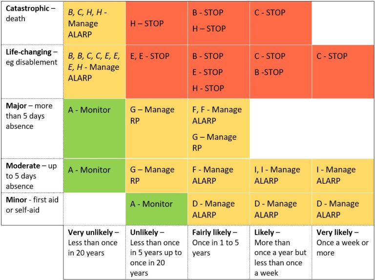
Figure 10.8: Categorised and colour-coded decisions
-
- I – Imagine that the manual handling MSK injuries resulted in people taking more than 5 days off work more than once a year. Would that change my priority from ‘manage’ to ‘stop’?
- B – Imagine that if instead of adding segregation between pedestrians and vehicles, all pedestrians were put in pods, so that if they are hit by a vehicle they suffer whiplash (and take more than five days off work) but no permanent injury. Would that change my priority from ‘stop’ to ‘manage’?
- F and G – If working on ladders and work-related stress is causing people to be off work for months every year, would we still think we could ‘manage’ the problem or would we need to take more drastic action to stop a key cause of stress?
I’m going to make a conservative assumption that my ‘judges’ decided if MSK injuries were leading to absences of more than 5 days more than once a year, they would want to change the rating from ‘manage’ to ‘stop’ (and that the pedestrian pods weren’t a reliable option for reducing injury severity). In discussion, they also decided that where stress or falls from ladders were causing long absences, perhaps the original assumption that a ‘manage’ strategy was sufficient should be reconsidered. The problem was the 5 days absence cut off.
I’ve seen many risk grids that use 3-days or 7-days because of the original or revised RIDDOR regulations. But that’s about reporting accidents. What figure would be useful for assessing risk? My imagined judges discussed this, and decided to split the major category into two time categories – 5 days to 2 weeks, and over 2 weeks.
So my final coloured grid would look like Figure 10.9 – I’ve now removed the scenarios, as they were there to help us colour the grid and are no longer needed.
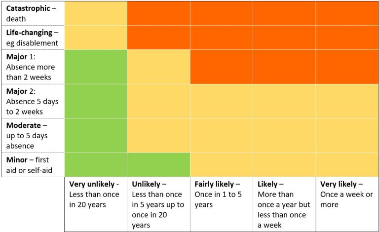
Figure 10.9: Colour-coded grid
We’ve ended up with a larger, not smaller matrix than before. But let’s see what happens next.
10.7 Test the boundaries
Your task:
Using the current version of your organisation’s risk matrix, or any proposed alternatives this chapter might have prompted (or the version in Figure 10.9 if you don’t have your own), apply these tests:
- No green block should share a ‘flat’ boundary with a red block. There are some who argue that green and red blocks shouldn’t share corners either, but this becomes increasingly difficult to avoid as the grid gets smaller. As the grid shouldn’t be considered mathematically accurate, I’m happy with shared corners (just not shared boundaries).
- Check to see if any rows have the same pattern of colours – in Figure 10.9, the first two rows are the same.
- We also have two rows in the middle that look the same. By splitting the previous major score into two rows (5 days to 2 weeks, over 2 weeks) our judges were better able to agree on the outcomes. So we can join the lower severity end of ‘major’ into the ‘moderate’ row.
- Check to see if any columns have the same pattern of colours – in Figure 10.9, the last three columns are the same.
At the end of section 10.4, I mentioned we might ‘collapse’ the grid – as you can see now, we have the evidence to do this, as collapsing the first two rows and the last three columns will produce the same risk decisions. I’ve shown this in Figure 10.10.
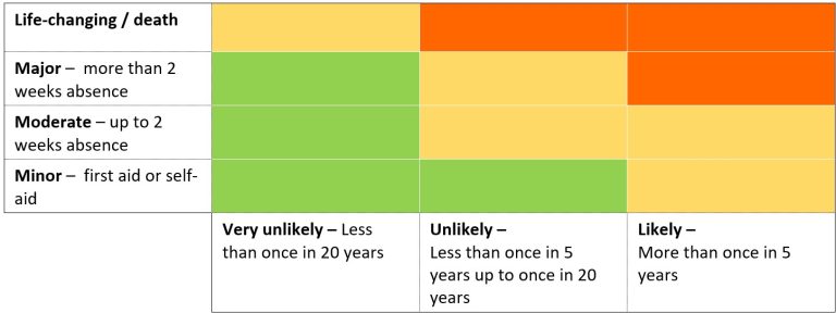
Figure 10.10: Reduced grid
You could now start from the beginning of this chapter with your new grid. Re-assess the scenarios (with your team if you can, or otherwise on your own) and see if agreement is any easier. My imaginary team have done so, and Figure 10.11 shows how I’ve improved the agreement levels between risk assessors.

Figure 10.11: Situations re-assessed
10.8 Conclusion
What we did in section 10.6 might have convinced you that you don’t need a risk matrix. You’re not running a high hazard chemical or gas processing plant, an airline, a nuclear power station or a railway. Your hazards are familiar ones like work at height or noise, where there is plenty of advice and best practice available. You can make decisions without a matrix, provided you have:
Defined the hazard clearly (see Chapters 2 and 3) with a clear statement of the most-likely worst-case scenario (or perhaps more than one scenario).
- Considered everyone who could be harmed (Chapter 4).
- Put all mandatory controls in place (Chapter 6).
- Measured hazards that can genuinely and usefully be measured (like noise – see Chapter 8).
You might decide you do want a matrix, but you’ve now realised it doesn’t need (and shouldn’t have) numbers on it. You’ve worked through this chapter and the previous one (Chapter 9) so that your matrix:
- Is as simple as it can be, with as few categories as you can get away with.
- Has likelihood categories with agreed meanings.
- Has severity categories with agreed meanings.
- Uses action-oriented outcome descriptions, and have as few as you can
- Has been tested by your own assessors (not just by consultants like me) with typical hazard situations from your organisation.
- Is not copied from any book or website, even this one.
A third, sadder alternative, is that you don’t have the authority to change the matrix you use in your organisation. I’ve been there. Forced to use an overly complex and poorly defined risk matrix. But you can do something to improve the process, even if you are forced to use a 7×7 matrix with 13 defined outcomes. You can produce your own guide to using the matrix which defines how to assign hazards to each likelihood and severity category, and what the outcomes mean in relation to monitoring, managing or stopping. Use examples from your organisation so that everyone understands how to apply the matrix more consistently.
Whether or not you are allowed to change, modify or dump your organisation’s grid we have spent enough time on assessing risk. Let’s stop assessing, and focus on the actions that make the world a safer place. In Chapter 11 we focus on controlling the risk.
Request for feedback
This chapter took me the longest to write (so far), partly because I went around in circles with the examples. Please let me know – does the example work? Is it too complicated? Is it credible? If it doesn’t work for you, what would help you? Were you convinced at the end of Chapter 9, such that this chapter isn’t even necessary? My apologies too that as a result many of the tables are images rather than text – it is quicker to edit them this way, but once I have some feedback on what works, accessible versions of these will be provided.
You can use the Contact form to send me feedback. If you’d like to receive an email when I add or update a chapter, please subscribe to my ‘book club’
Alternatively, you can go back to the book contents page.